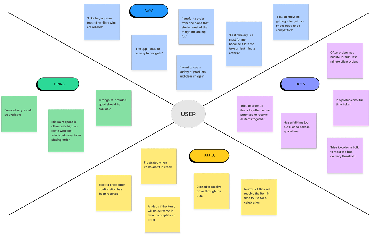
Empathy Map
An empathy map was created to gain a deeper understanding of our users.
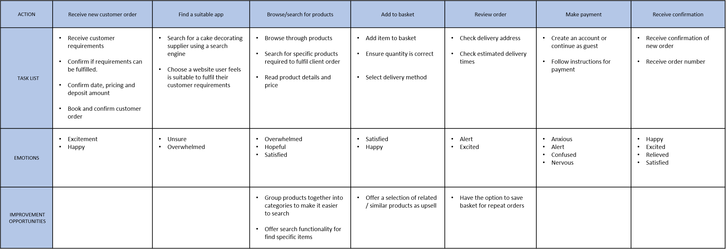
User Journey Map
A user journey map was created to help visualise the process our user takes to successfully place an order on the Baking Stash web app. This allowed us to understand each action taken, as well as identifying opportunities for improvements.
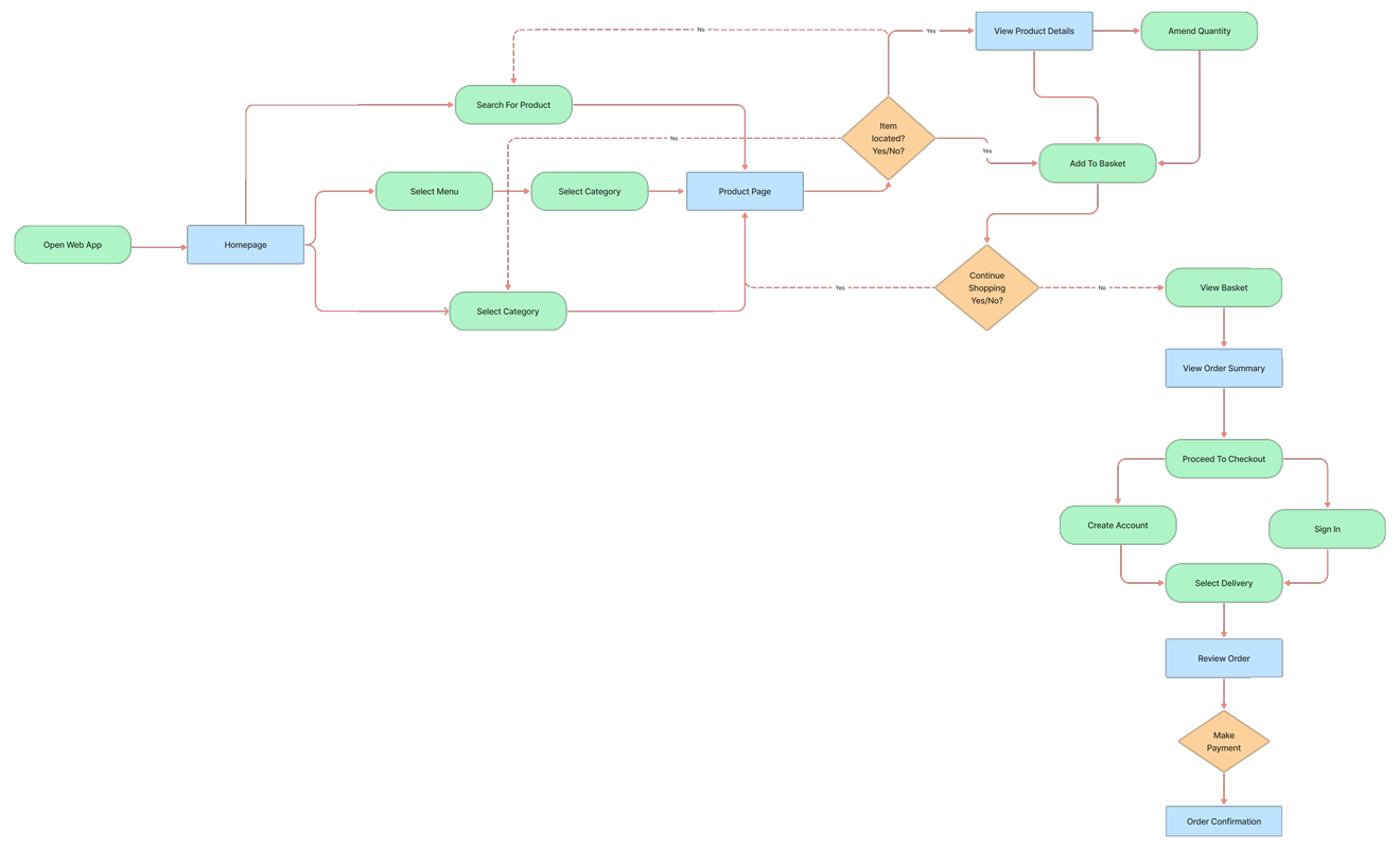
User Flow
To help us understand the path taken by a typical user on the web app, which covers all potential loops, decision points and exits, we created a User Flow diagram.
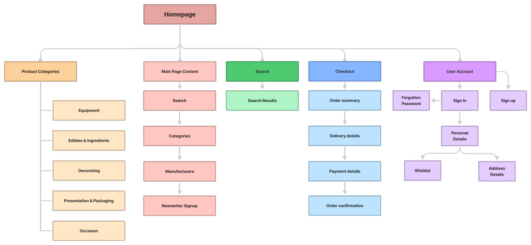
Information Architecture
To help us organise where information will be placed, information architecture allows us to structure the contents of each section of the web app. It is important to keep in mind where the user will naturally look for information.
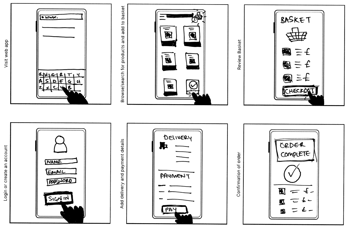
Storyboard
Our close-up storyboard tells the user's story, on how they would use the web app, in a sequence of panels. It takes into account our persona and the problem statement.
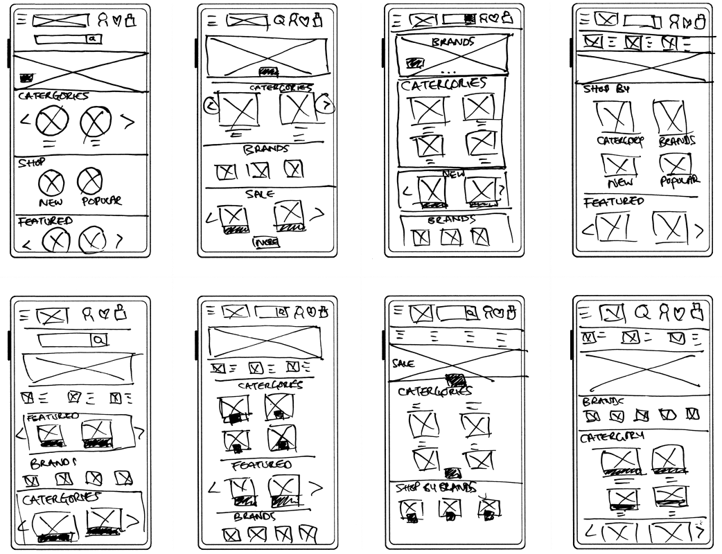
Paper Wireframe
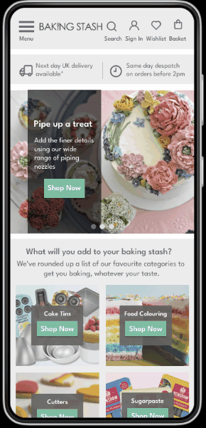
The goal for the Baking Stash app was to allow professional cake bakers to easily locate their items and place an order, selecting a suitable delivery option which included the option for next day delivery.
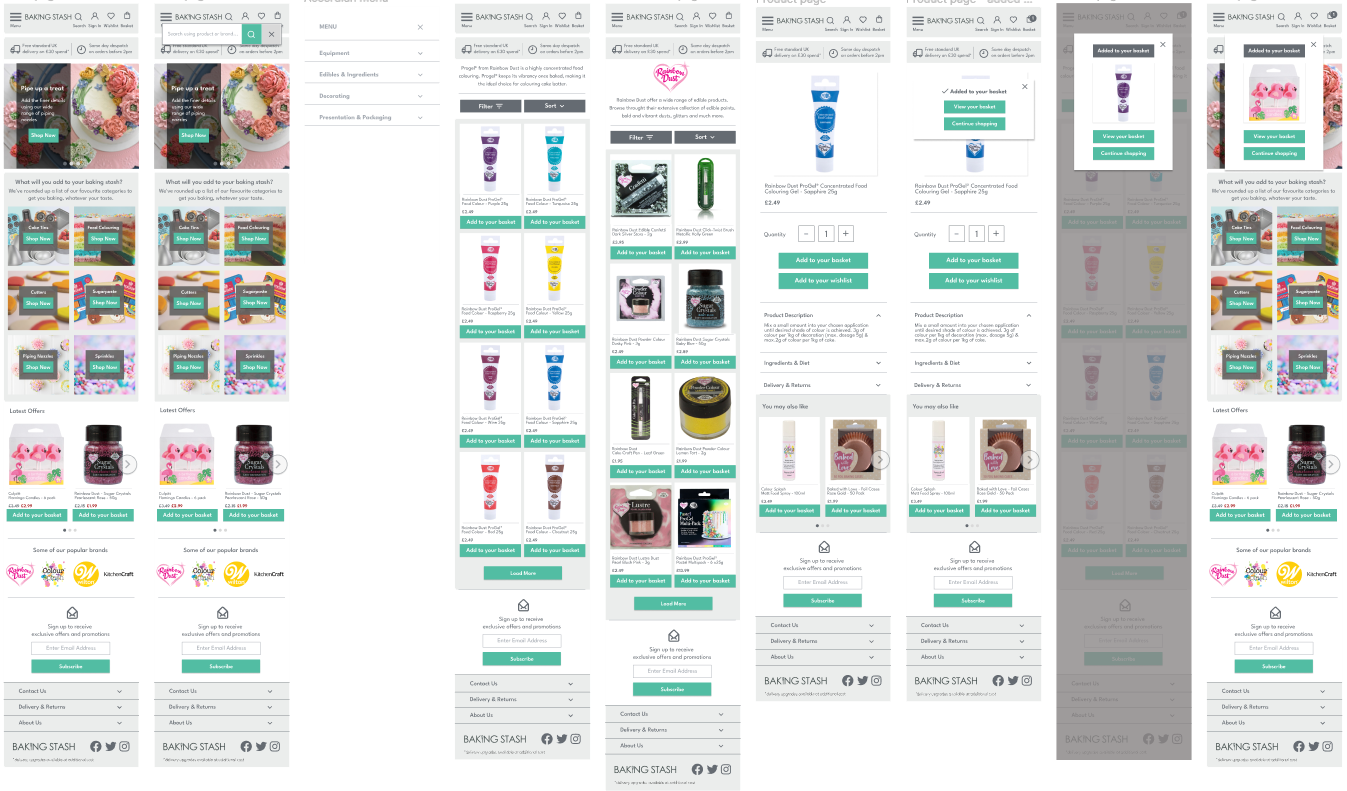
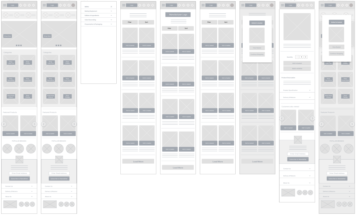
Digital Wireframe
Using Figma, I was able to create digital wireframes which allowed all stakeholders to visualise the design with a higher degree of accuracy for contents and scale.
A usability test of the low fidelity prototype allowed me to gain an insight on how users move through the app and make adjustments accordingly based on their feedback.
High Fidelity Prototype
High fidelity prototypes provide more detail and are considered the most complete blueprint of the final design. This design contains imagery and text and is as close to the final design as possible.
Following visual design principles, I was able to bring my designs to life using colour, typography and iconography.
My designs successfully allowed me to emphasise the next day delivery options available to our customers. This was placed at the top of the page, and was one solution to resolve our problem statement.
In addition to this, we wanted to reassure users that the business would also process and dispatch orders placed before 2pm the same day to avoid any delays in receiving their order.
I organised the products into categories to allow users to easily navigate through the homepage and locate the products they required. Users also had the option to use the menu bar to browse through all categories or search for a specific product.
For users seeking specific brands, I created an interactive carousel with manufacturer logos which would take users to a brand specific landing page.